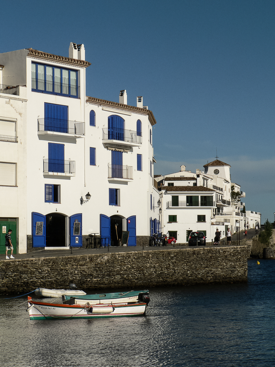
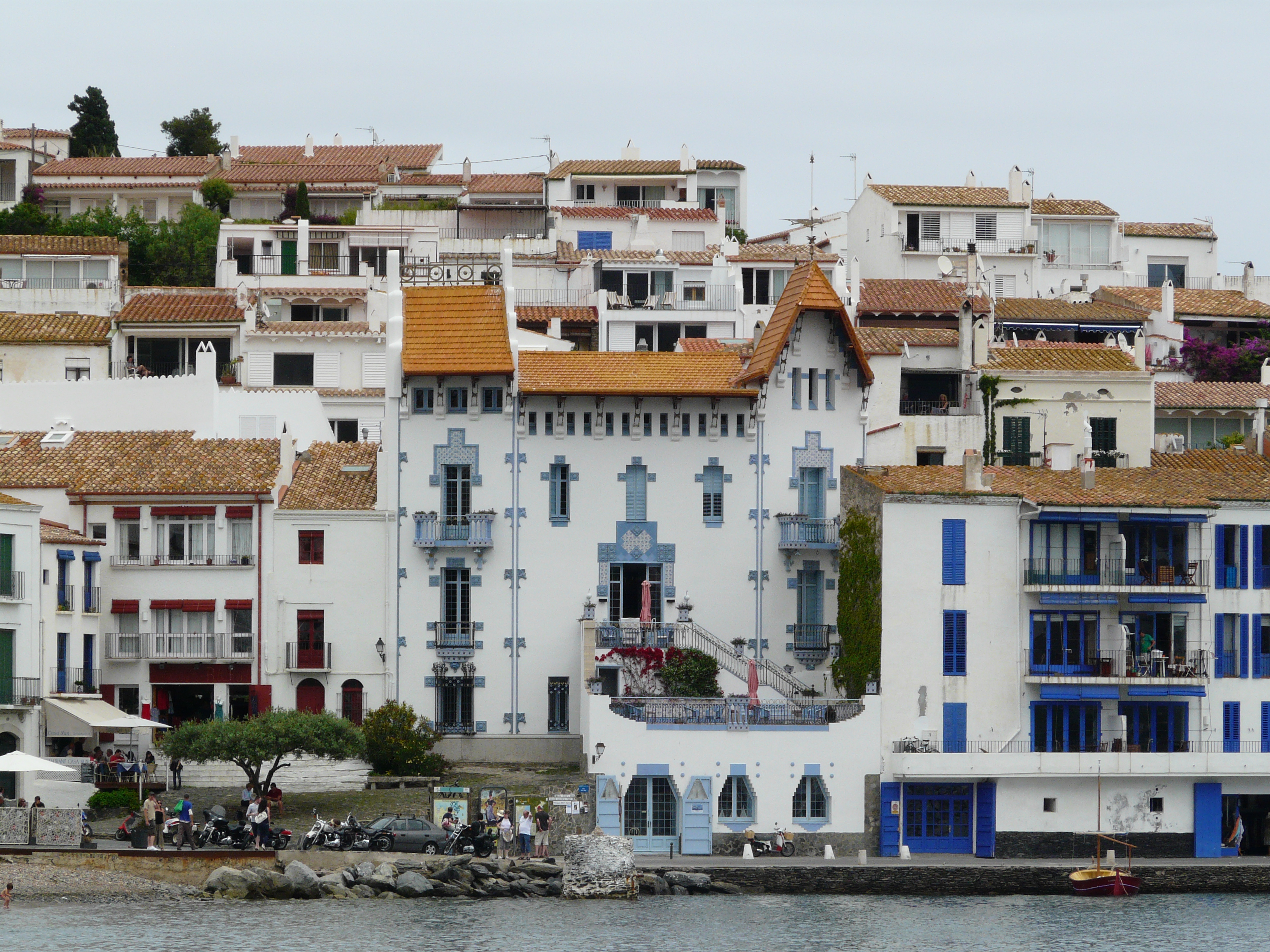
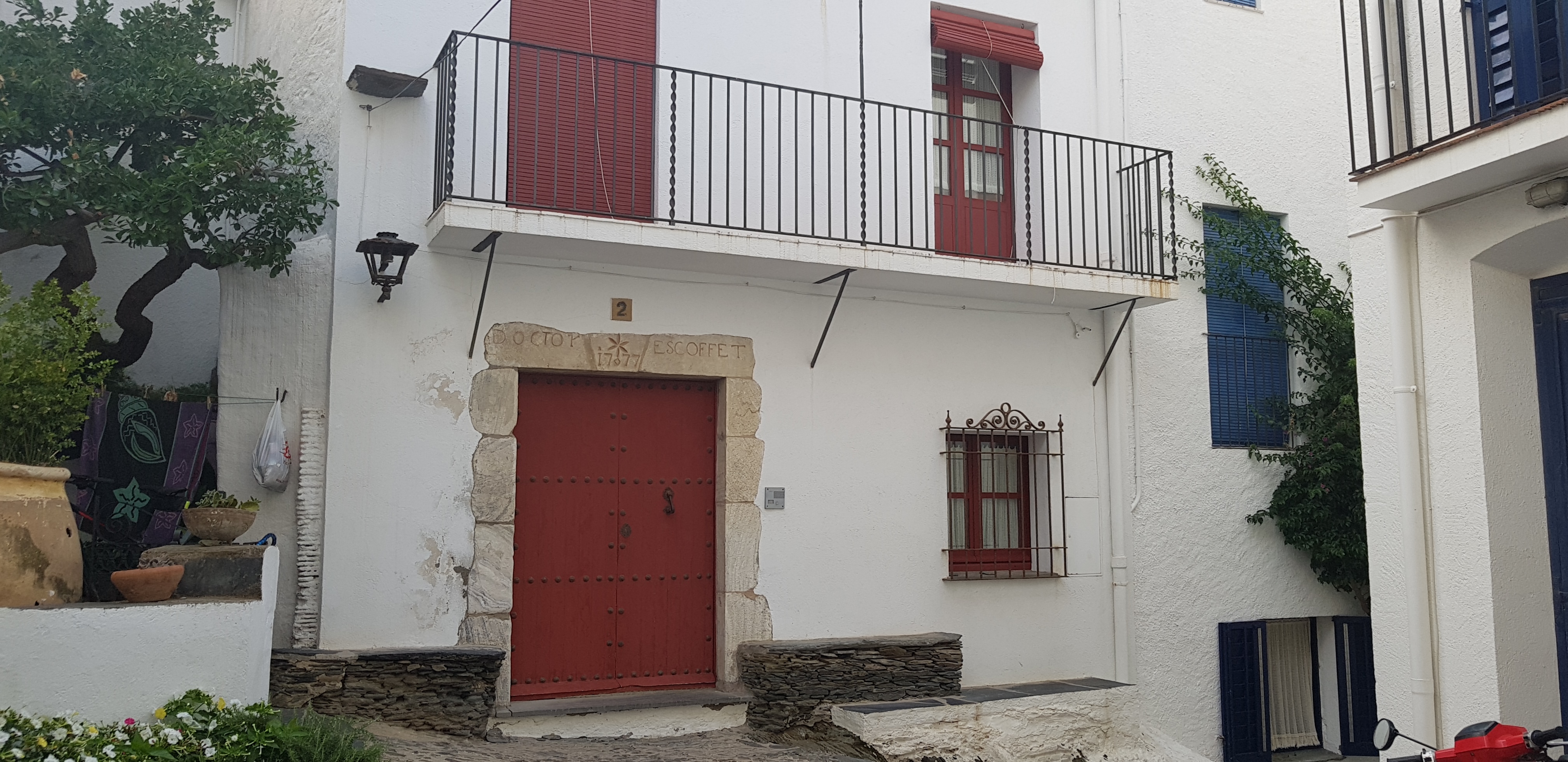
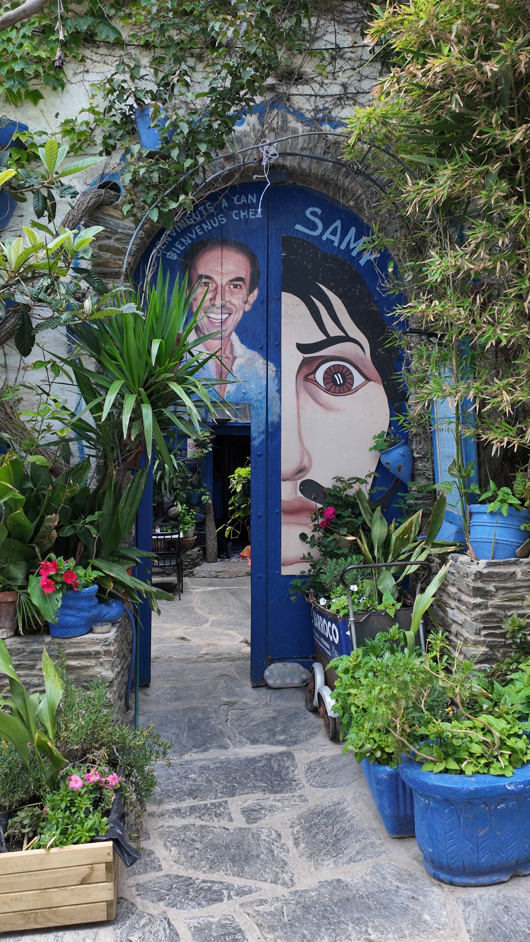
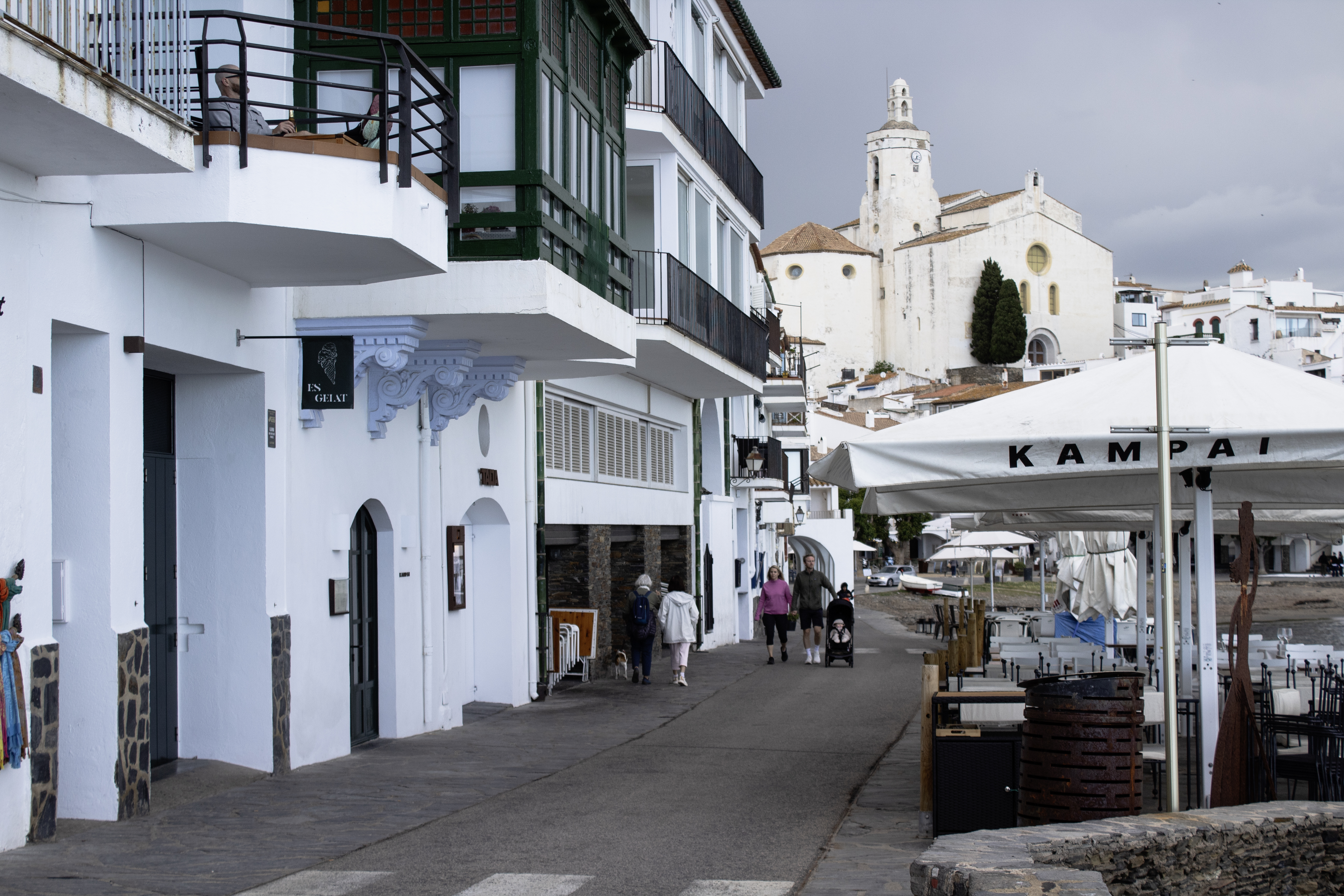
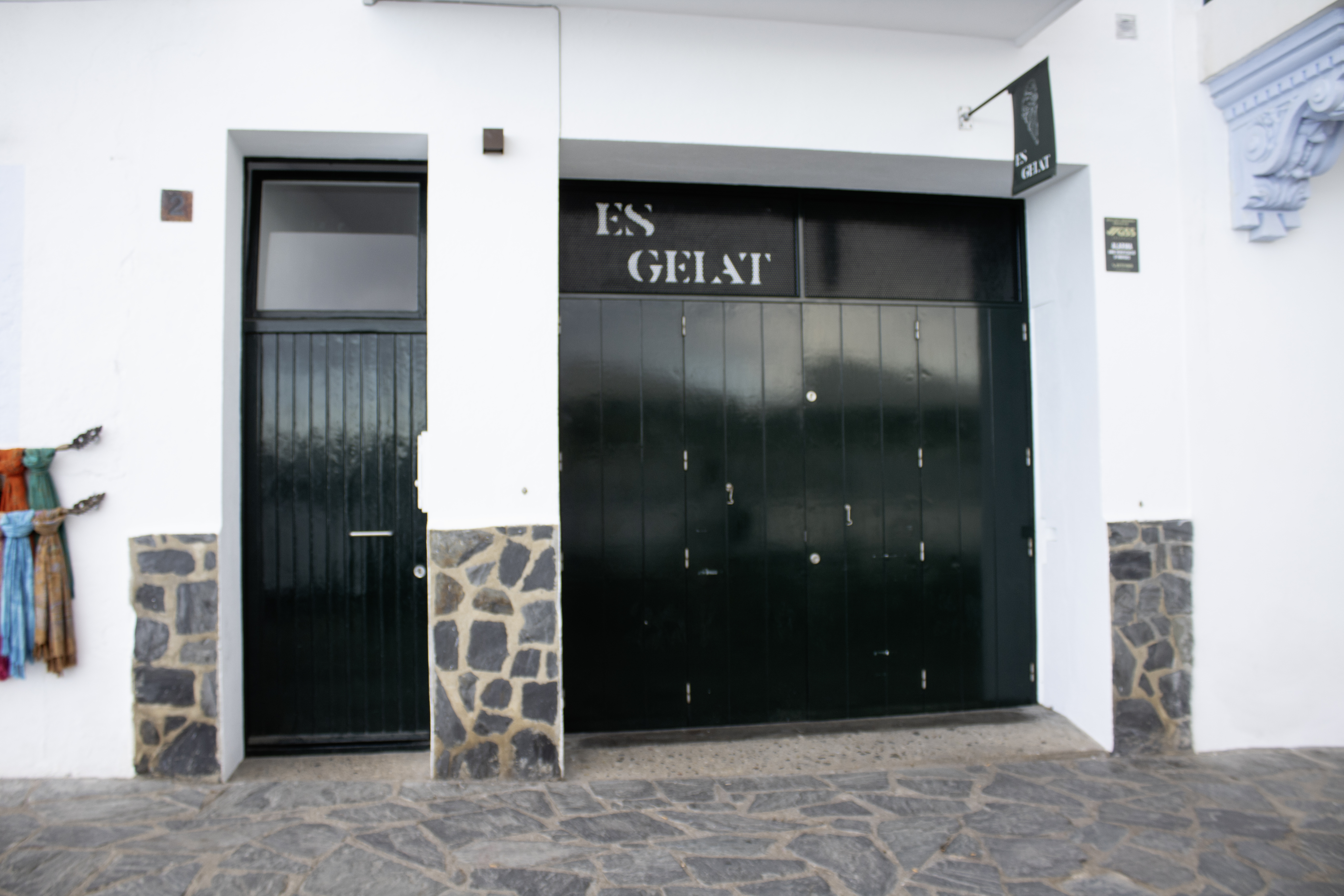
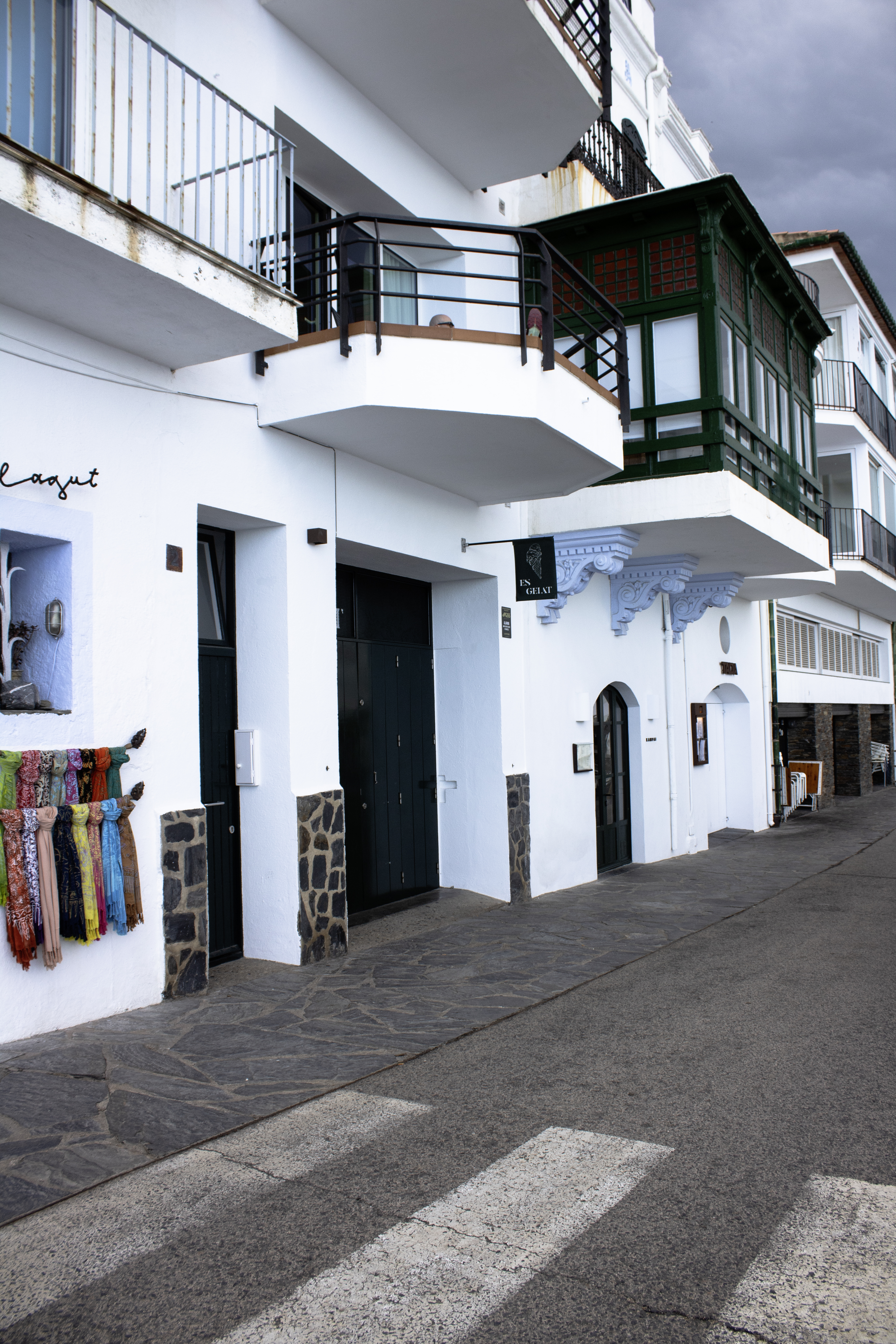
This is not a uniform palette, but a lively combination that changes according to the period, the type of dwelling and the area of the town. The modest houses of the historic centre, the buildings along the seafront and the Modernist residences incorporate colour in different ways, creating a visual identity that is more varied than the conventional image of Mediterranean villages might suggest.
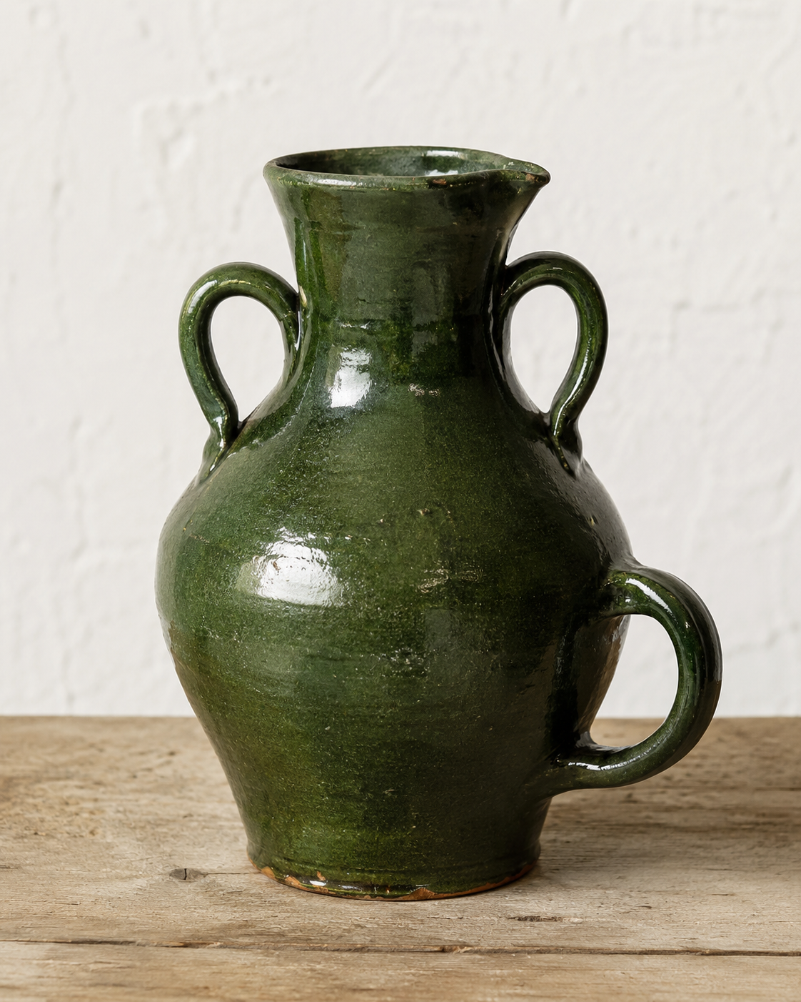
Among all these shades, dark green possesses a particularly recognisable strength. Its repeated presence on doors and shutters is reinforced by its connection with the doll, the traditional green-glazed vessel once used to collect and carry water, which eventually became one of the most characteristic symbols of Cadaqués. Blue, meanwhile, evokes the maritime landscape and is especially prominent in certain Modernist buildings, while reds, burgundies and earthy tones provide contrast and recall the ceramic tradition of the Empordà.
Beyond the Mediterranean cliché of white and blue
The combination of white and blue has become a generic image of Mediterranean coastal villages, although it was never a common rule throughout the entire region. Each place developed its own solutions based on its materials, local trades, commercial contacts and the successive transformations of its buildings. Cadaqués shares the white façades found in many coastal architectural traditions, but its visual identity is more complex and less uniform.
The town’s historical isolation helped to preserve distinctive features—from its speech and customs to certain forms of construction—but it did not produce a completely fixed colour palette. The historic centre, the modest fishermen’s houses and the Modernist residences along the seafront belong to different periods and contexts. They should not, therefore, be interpreted as though they had all followed a single chromatic rule.
White: the truly predominant base
Heritage sources describe Cadaqués through its whitewashed or limewashed façades, sloping streets, stonework and landscape of olive trees. The overall image of the town therefore arises from the contrast between large expanses of white and a series of smaller coloured elements.
Limewashing was not merely decorative. In traditional construction, layers of lime acted as a protective finish for walls, reduced rain penetration and helped permeable masonry to dry. Likewise, exterior woodwork required regular painting to protect the timber from the weather. This practical function explains why façades and shutters were maintained and repainted, but it does not in itself demonstrate why a particular colour was chosen.
Does green, blue or red predominate?
The most rigorous answer is that, after white, no clear winner can be established. Dark green appears frequently on doors, large gates and shutters. Blue—from cobalt to turquoise—is highly visible on façades and woodwork and has become particularly photogenic. Red, burgundy and ochre act as warmer counterpoints, appearing on doors, mouldings, ceramics and architectural details.
Perception also changes depending on the area being observed. Deep green may stand out on the more restrained houses, while blues and polychrome compositions attract attention along the promenade and in Modernist architecture. Furthermore, successive restorations and repainting make it impossible to regard the town’s present appearance as an untouched image of a single period.
Green and the doll: a documented connection
The strongest argument for considering green a defining colour of Cadaqués is not found in any supposed regulation concerning shutters, but in the doll de Cadaqués. The Museu del Càntir describes it as a vessel with a spout and three handles, entirely glazed in green, characteristic of Cadaqués and originally produced in Figueres. It was used to collect and carry water, and its shape made it possible to carry it on the head and pour its contents with ease.
Specialist documentation adds that, when the last pottery workshops in Figueres closed at the beginning of the 1970s, several potters from La Bisbal continued to produce it. The chronology should therefore be clarified: Figueres was the traditional centre of production, while La Bisbal took over in more recent times.
The green of the doll did not come from the same type of paint used on wood. It was a glazed ceramic finish. The Terracotta Museu explains that traditional pottery from La Bisbal used a palette of straw-coloured, red and green tones, and that green was obtained by adding copper oxide to the glaze. Doors and dolls therefore shared a chromatic similarity, but not the same material or technique.
Blue: Modernism, the sea and visual representation
Blue possesses a different kind of symbolic power. It is immediately associated with the sea and sky, but Cadaqués also has an exceptional architectural example: Casa Serinyana, also known as Casa Blaua, built between 1913 and 1915. Its name confirms that blue is not a recent tourist addition, but a colour with a historical presence in local architecture.
Official sources indicate that several Modernist houses along the seafront were commissioned by residents of Cadaqués who had made their fortunes in the Americas, and that some were inspired by Cuban architecture. This influence can be seen in the richness of the vivid colours and the striking use of materials. Blue achieves a particularly prominent ornamental presence here, but it should not be extended to every house in the town as though there had once been a general obligation to paint buildings blue.
Red, terracotta and warm accents
Red and burgundy are less dominant in panoramic views, but they are important for understanding the town’s local variety. They appear in woodwork, mouldings, flowers, ceramic pieces and earthy shades. Traditional pottery from the Empordà combined greens with reds and straw yellows, demonstrating that the material culture of the area was never monochromatic.
In Modernist architecture, warm tones also balance the blues and greens. It would be inaccurate to attribute them to a single cause: they may derive from ceramics, the pigments available at the time, the owner’s personal taste, influences brought back from the Americas or later restoration work. What is documented is the deliberate use of colour in some of these houses—not a fixed hierarchy among the different shades.
From practical function to popular taste
Paint protected the wood, shutters regulated light, heat and wind, and lime preserved the walls. Nevertheless, the repeated use of these solutions created something more than a practical response: it produced a collective aesthetic. White provided a shared background, grey stone anchored the town to the landscape, and green, blue and red introduced rhythm, contrast and personality.
The connection between green and the olive trees and vegetation of Cap de Creus may seem visually convincing, but it should be understood as an aesthetic interpretation of the landscape rather than a historically proven cause. The same applies to the association between blue and the sea: it helps to explain our present-day perception, but it is not sufficient to reconstruct the origin of every painted surface.
A distinctive palette, not a single-colour code
The most faithful description of Cadaqués would be that of a town of white façades and grey stone, enlivened by green and blue woodwork and by red, burgundy, ochre and ceramic accents. White is the predominant colour; among the secondary colours, no quantitative majority has been demonstrated.
Green nevertheless retains a special significance. This is not because it can be proven that every house used it more often than blue, but because it connects everyday architecture with one of the most characteristic objects in local memory: the doll. Blue contributes the maritime and Modernist image, while red and earthy tones evoke ceramics and the polychromy of the Indiano houses. Together, they form an identity that is richer and more authentic than the uniform cliché of white and blue.